McDonald’s Color Tokens
As part of a library refactor initiative, this project focuses on auditing, researching, designing, and delivering sets of primitive and semantic color tokens for the McDonald’s design system – the secret sauce for a versatile application of color across design and code. Now, armed with a fresh palette, we are laying the foundations for an experience that is as satisfying as your favorite McDonald’s meal!! 🎨🍔
My Role: Lead System Designer
Tools: Figma

Background
In the recent history of McDonald's, experience design was outsourced to external agency partners, who crafted libraries catering to the fast-food giant's unique needs at the time. In a bid to enhance internal experience design efforts, our in-house team was established, taking over the responsibility of maintaining them. However, these libraries struggled to scale and meet the evolving needs of our organization and products.
Teaming up with engineering, we realized it was time for a revamp. We’re crafting some fresh libraries seasoned with design tokens, flexible, accessible components, and a side of comprehensive documentation. This initiative is a step toward enhancing our design ecosystem to meet the ever-changing and dynamic needs that McDonald’s has on its plate.
The Problem(s)
Inconsistent color usage across platforms.
Inefficient updates to color in design and production (amassing hundreds, if not thousands of hours of design & tech debt over time).
Limited palette which posed an issue for interactive state changes, dark mode and did not support designer needs (values strayed from Figma styles in design & production).
Unclear or non-existent guidelines for color behavior & usage.
Many color contrast issues across components.
No shared language between design and development.
The Solution
Primitive and semantic set of color tokens that contributes to a more organized, efficient, and adaptable design system, promoting collaboration and consistency while facilitating the management of design elements
The Process
Inspiration
Ideation
Execution
what once took McDonald’s roughly 39,000 development hours to globally update link colors, will take less than an hour using these color tokens.
Inspiration
In this initial phase we cataloged color styles from Figma, McDonald's branding, and the digital guidelines site. The platform engineering team then extracted hex values from iOS and Android production environments, enabling a comprehensive color synthesis. This synthesis not only highlighted color variations but also pinpointed new needs in our palette. We then conducted extensive research into other design system color tokens, drawing inspiration and benchmarking against industry standards. This gave us key information to identify opportunities as we went into the ideation phase.
How might we…
Implement tokens to clearly define usage and behavior?
leverage tokens to ensure contrast meets accessibility standards throughout our channels?
adapt to different contexts, modes, or themes?
define our token tiers?
maintain brand consistency while utilizing a diverse range of colors?
Ideation
In the ideation phase, we defined our token tiers, including a primitive and semantic set. Leveraging a color scale generator plugin, we crafted dynamic color ramps that seamlessly transitioned from light to dark. Through adept swapping of hex values and meticulous adjustments, our palette evolved into a visually harmonious spectrum.
Execution
Primitive Set
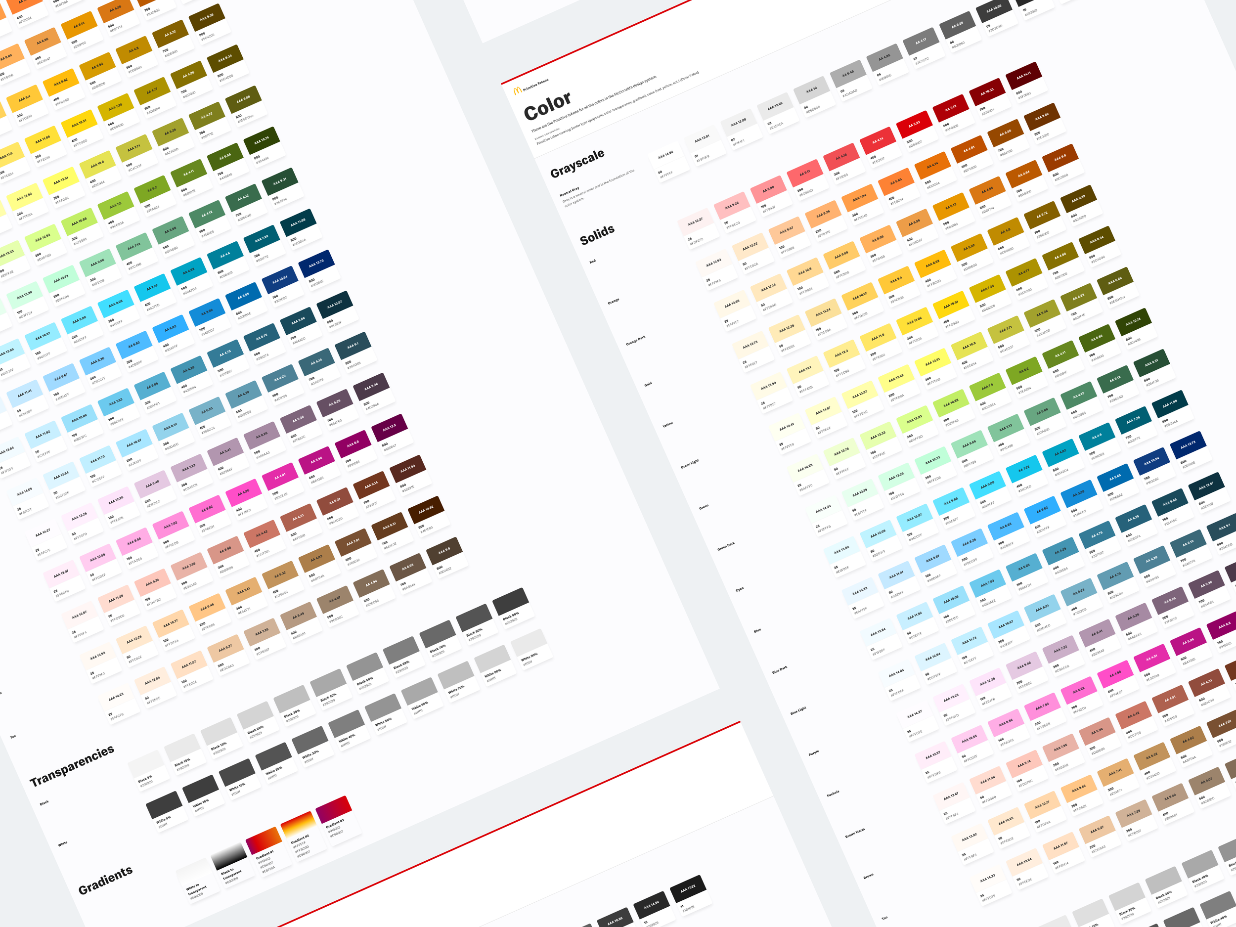
Primitive tokens act as elemental building blocks, cataloging fundamental design decisions and ramp values.
Within our solution, we've thoughtfully organized it into four distinct categories: Greyscale, Solids, Transparencies, and Gradients. Each value within these categories is assigned to a color group, such as gold, and a corresponding number. The decision to use values of 100 ensures the flexibility of our system to accommodate new additions in the future, should the need arise.
Learn more about types of design tokens.
Semantic Set
Within our semantic set, we have streamlined the organization of our values into three distinct categories: fill, border, and text, aligning with their application in both designs and code. This specialized set incorporates lighter values strategically, ensuring a minimum contrast ratio of at least 5.0. By doing so, we aim to enhance accessibility and readability, delivering a refined and user-friendly experience in darker environments.
Figma Variables
We've leveraged Figma variables to streamline our design processes, enabling seamless synchronization across multiple design files within our enterprise.
Dark Mode in action!
Video of turning a light mode screen to dark mode

