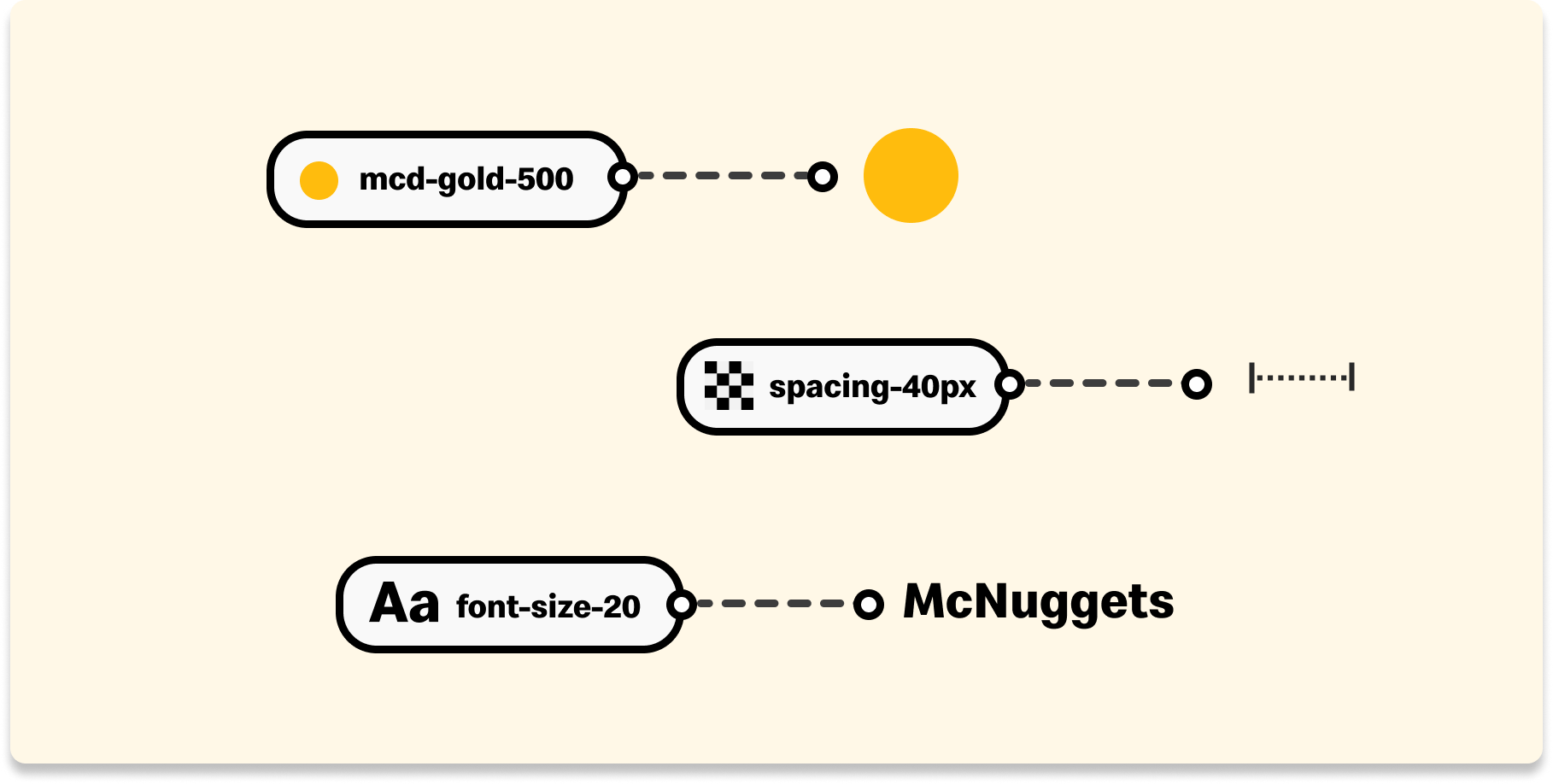
What are design tokens?
Design tokens are individual units of design decisions that encapsulate visual properties, such as colors, typography, spacing, and other style-related attributes. They act as a bridge between design and development, providing a systematic way to manage and maintain a consistent design language across various platforms and devices.
For example, instead of hardcoding specific color values directly in the code, a design token named "primary-color" could be established. This token would hold the chosen color value, and developers can then reference this token in the codebase. If a design change is required, it can be made centrally within the design tokens, automatically updating all instances where the token is used throughout the codebase.
By using design tokens, teams can enhance collaboration between designers and developers, streamline the design-to-development workflow, and maintain a unified visual identity across diverse digital products and platforms.
Token Types
Primitive Tokens
Primitive tokens represent basic, foundational design elements such as colors, typography, spacing, and other fundamental style attributes. They serve as the elemental building blocks of a design system. A primitive set houses all values within the system.
Alternative Names: Foundational tokens, Core tokens, Base tokens
Semantic Tokens
Semantic tokens convey meaning or context-specific information. They often define the intended usage or role of a design element, such as indicating that a color is meant for primary actions or that a particular font size is for headings. In various modes, themes or markets, the definition of a primary color may vary. Introducing alias tokens tailored to specific usage scenarios enhances the adaptability, efficiency, and scalability of our system. When a value is modified, this adjustment seamlessly propagates globally to all instances, ensuring a unified and easily adaptable design system.
Alternative Names: Alias tokens, Meaningful tokens, Contextual tokens, Purpose-based tokens
Component Tokens
Component tokens encapsulate the design decisions related to reusable UI components. These tokens define the styles and behaviors of larger, composite elements like buttons, cards, or input fields. They offer an extra layer of specificity to fine-tune any system-specific components or specific uses cases that may not be global.
Alternative Names: UI Component tokens, Widget tokens, Module tokens


