Camping World Design System
With a growing team and inconsistent UI, the need and opportunity to establish a design system became a priority. As the second designer hired and a love for organization, consistency, ADA and all things design, I lead the establishment of foundational elements for a growing and evolving design system at Camping World.
My Role: Lead UI Designer, Design System Librarian
Tools: Sketch, Invision DSM

Background
When I started working at Camping World in 2019, I was the second UIUX designer hired. The hardest part of this process was convincing stakeholders that a design system was worth the time and resources. While we faced many obstacles in gaining complete trust and support, the development team shared a vested interest and we were given the go ahead to start, but only as a side project. Unfortunately, the design system was not seen as priority to the business, however it was a priority to the design team. I took it on leading the project hoping to show the importance and value over time.
The Problem(s)
No Clear Brand Style Distinction
When the company acquired Gander and Overton’s in 2017, the brand style standards that were established for Camping World were also used for the new brands.
The Camping World Identity Crisis
With no one driving and upholding company-wide creative direction, departments took liberties which caused visual disconnect and differing styles across all creative interfaces.
Different UI Elements & A Growing Team
E-commerce and RV sales are divided on the website as well as within the business as separate teams. This led to different UI elements, fonts, etc. and an inconsistent customer experience across the site. As our team grew with new hires and UIUX teams began to merge, we didn’t have an efficient way to share & reuse components.
Flagged for ADA
Pages were getting flagged for lack of contrast and text sizes while other websites were experiencing lawsuits regarding ADA requirements.
Goals
Continue to educate & sell stakeholders on the importance of design systems and benefits.
Analyze and take inventory of current ui components across the interface from retail and rv sites.
Create a design committee involving all creative teams to come to a consensus on our design philosophy, brand standards, style and components.
Build a strong foundation and create a system of naming conventions that is intuitive for designers, developers, and new hires that is flexible, and stands the test of time.
Democratize & delegate improved elements & components for designers to use across designs within Invision Design System Manager. Collect documentation and guidelines.
Define guidelines and a process for the team to follow.
Train other designers to start design systems for other brands.
The Solution
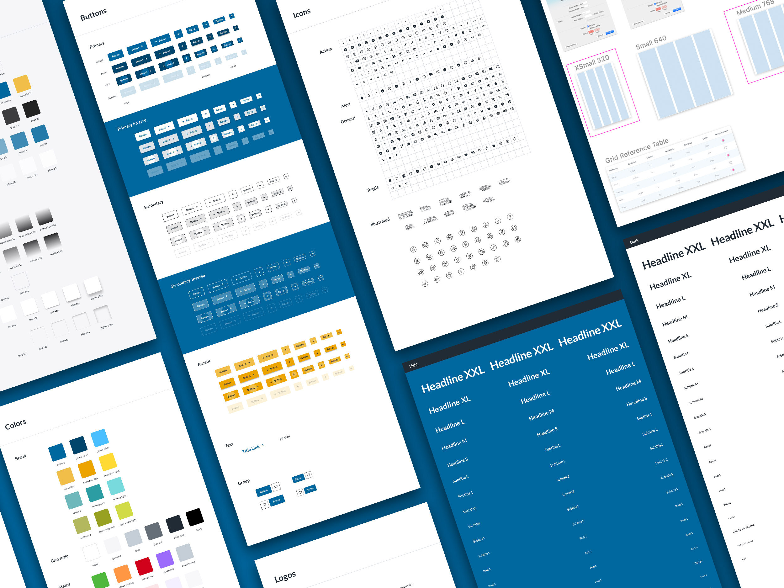
A Camping World design system that consists of UI components, documentation, design language and guidelines within InVision DSM.
Grids & Breakpoints
Colors & Layer Styles
Text Styles
Icons
Buttons
Components
The Process
Research & Analyze
My first step was to learn as much as I could about design systems. I used other design systems as my study guide and took note of their structures. I joined online design system discussions to listen to other company’s pain points and what worked for them. I reached out to people in Slack groups and asked questions. This ultimately helped me understand how I could make it work for Camping World. Once I developed a solid knowledge base, I started collecting past projects, sketch files and screenshots of live pages to analyze our current UI components. My main goal was to document and identify duplicates and bring them to the team for consensus.
Visual Identity
In an effort to align on brand standards and uphold creative integrity throughout all interfaces, I promoted the idea of collaborating with other design departments for alignment before we dug into the design system details. This meant discussing our design philosophies and come to an agreement on fonts, colors, icons, photography & voice. Once there was a consensus and it was approved by the business, we were able to move forward with the design system primitive elements.
Structure & Organization
I found one of the most important elements of successful design systems was building a strong foundation. That meant organizing our components & documentation, prioritizing features, and establishing naming conventions. To start I built out a sample structure in DSM and reviewed with developers & designers, making necessary revisions along the way. DSM offered a few features which was limiting at times, but we found mixing it with an atomic structure worked for us. This was important to establish before we set up our primitive library file.
Creation & Upload
Once the structure was defined and I had a clear idea of naming conventions, I started creating the primitive elements. Those elements included grids, colors, layer styles, text styles and icons. This was an important first step as going out of order could mean component issues such as symbol & style duplicates later down the road. Next was bringing in the existing components and linking to the new primitive elements, uploading to the DSM and adding any documentation and guidelines.
Manage & Grow
A design system is never finished. It was important to establish how to move forward and that included how to address issues in the future and how to establish a process to review and upload new components. I’m still learning, the team is still learning, but it has greatly improved our efficiency. Overall, the design system has become our source of truth and a great way to inform our design decisions.


